MY BRAND
2016
Owner/Designer
Here is how I reached the final brand for myself and the process I went through to get there.
2016
Owner/Designer
Here is how I reached the final brand for myself and the process I went through to get there.
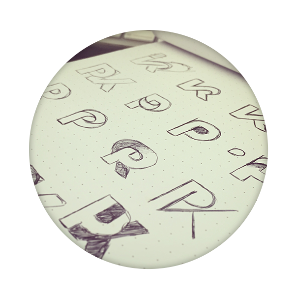
I would research fonts to get ideas on how to structure letters in unique ways. In my search I found Radikal font. I was pleasantly surprised at the use of the letter ‘K’ and it became the font for my entire website.
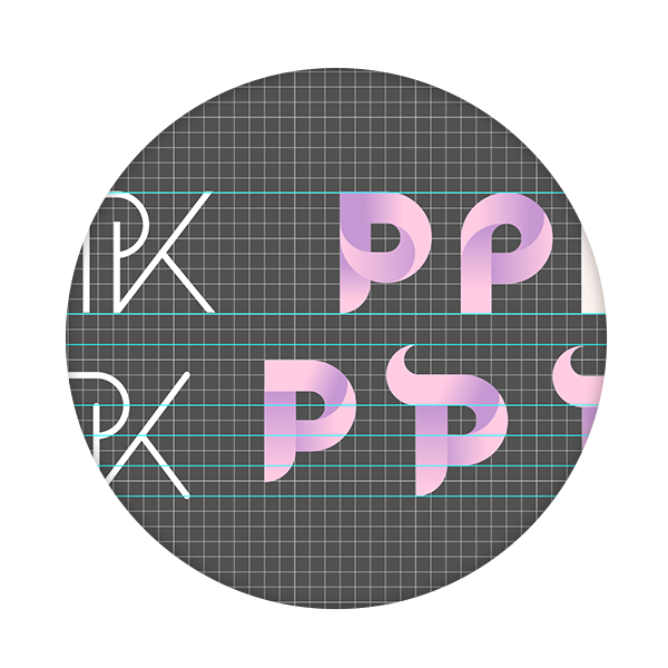
At first I was concentrating on using both letters "P" and "K" in the logo, but it never really quite captured what I wanted. I then started to just use P as the main focus of my logo.
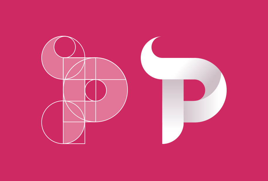
I chose 2-3 ideas I wanted to take a step further. I wasn’t concentrating too much on color at this point, however when I got to working more with depth I did start to use two tones. The goal was to have something geometric yet playful.